Transit System Safety Campaign
An annual, multi-touchpoint safety campaign designed to encourage behaviour change across transit environments through clear, human, and emotionally resonant brand expression.
ART DIRECTION · GRAPHIC DESIGN · CAMPAIGN SYSTEMS
MARKETING LEAD & STRATEGY: ALEX FEILEN
PHOTOGRAPHY: ADAM & KEV
Context
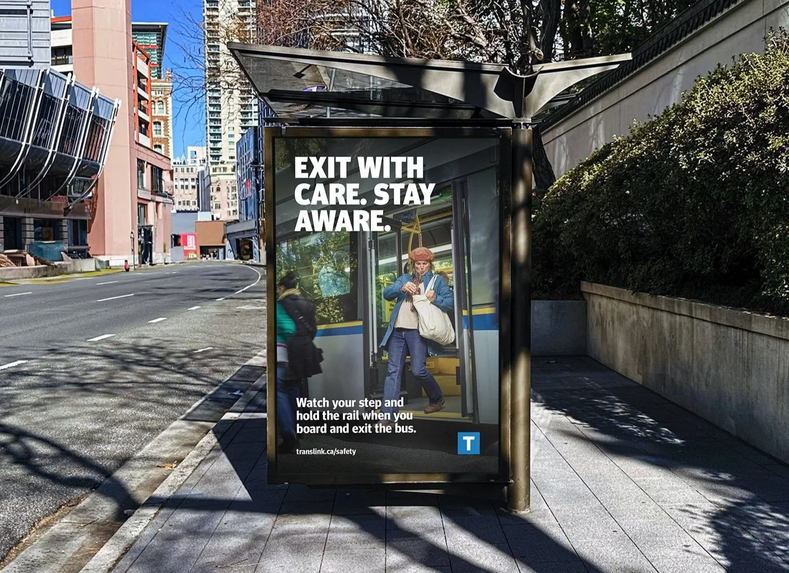
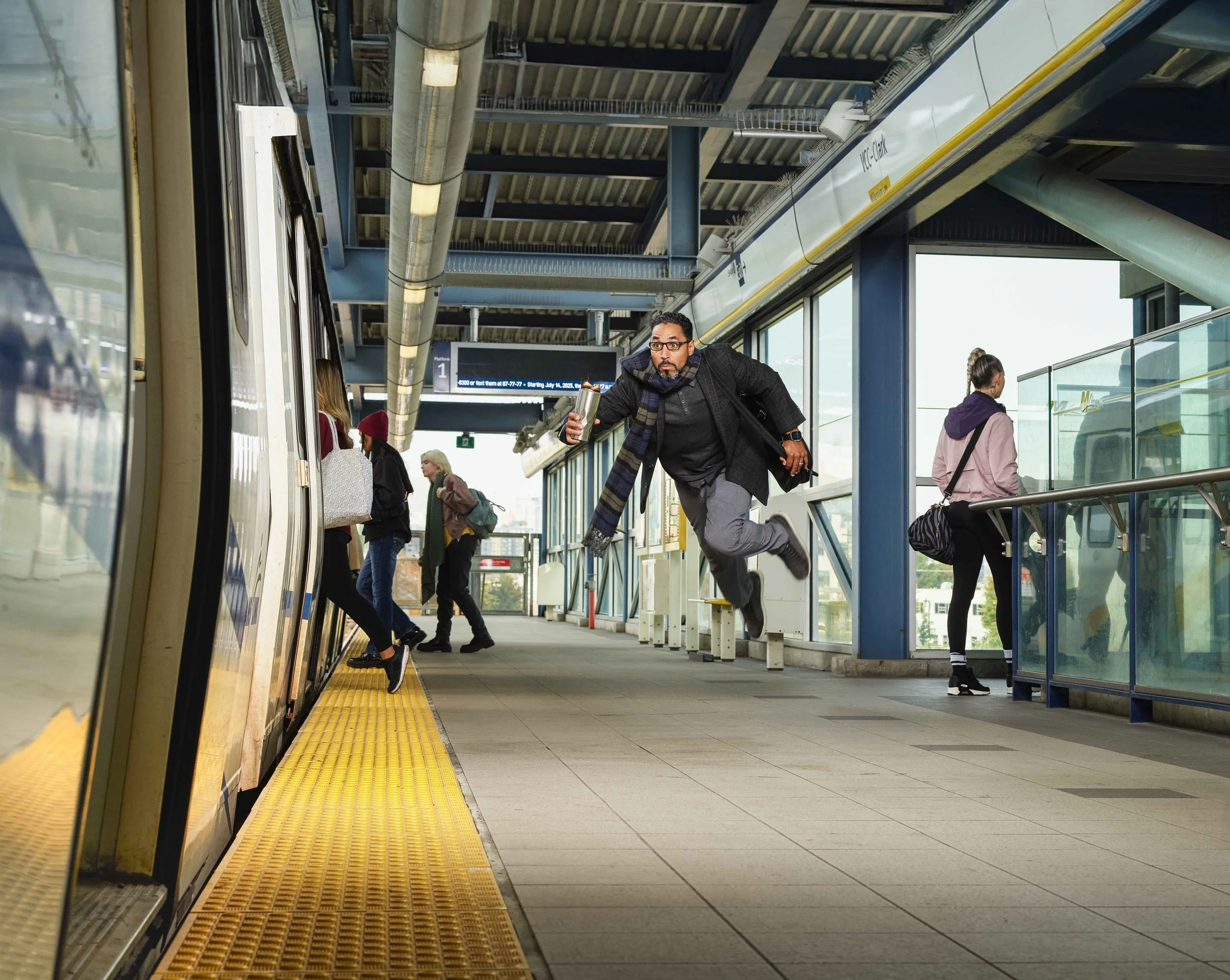
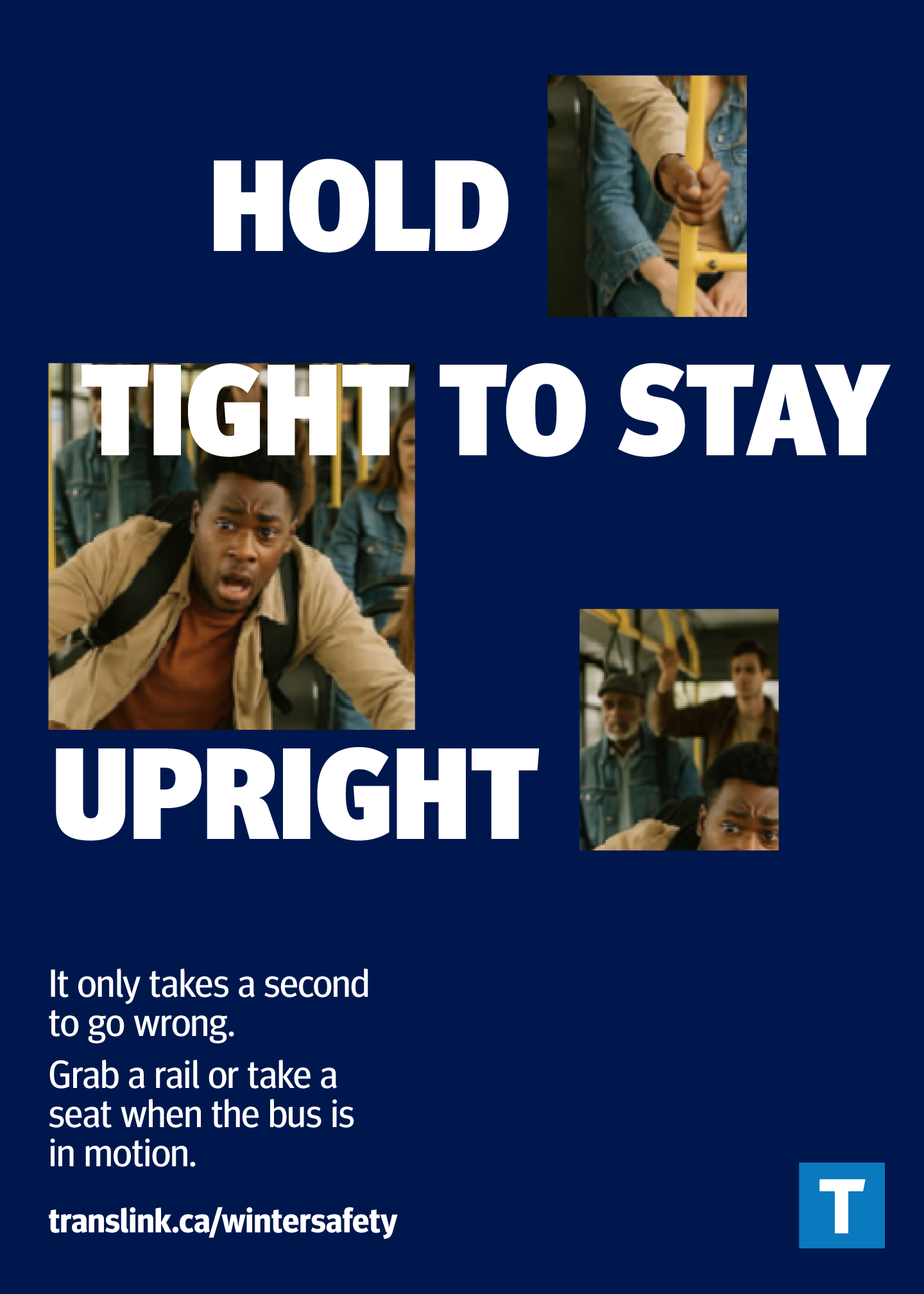
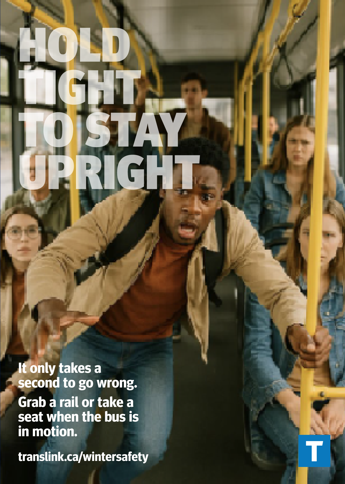
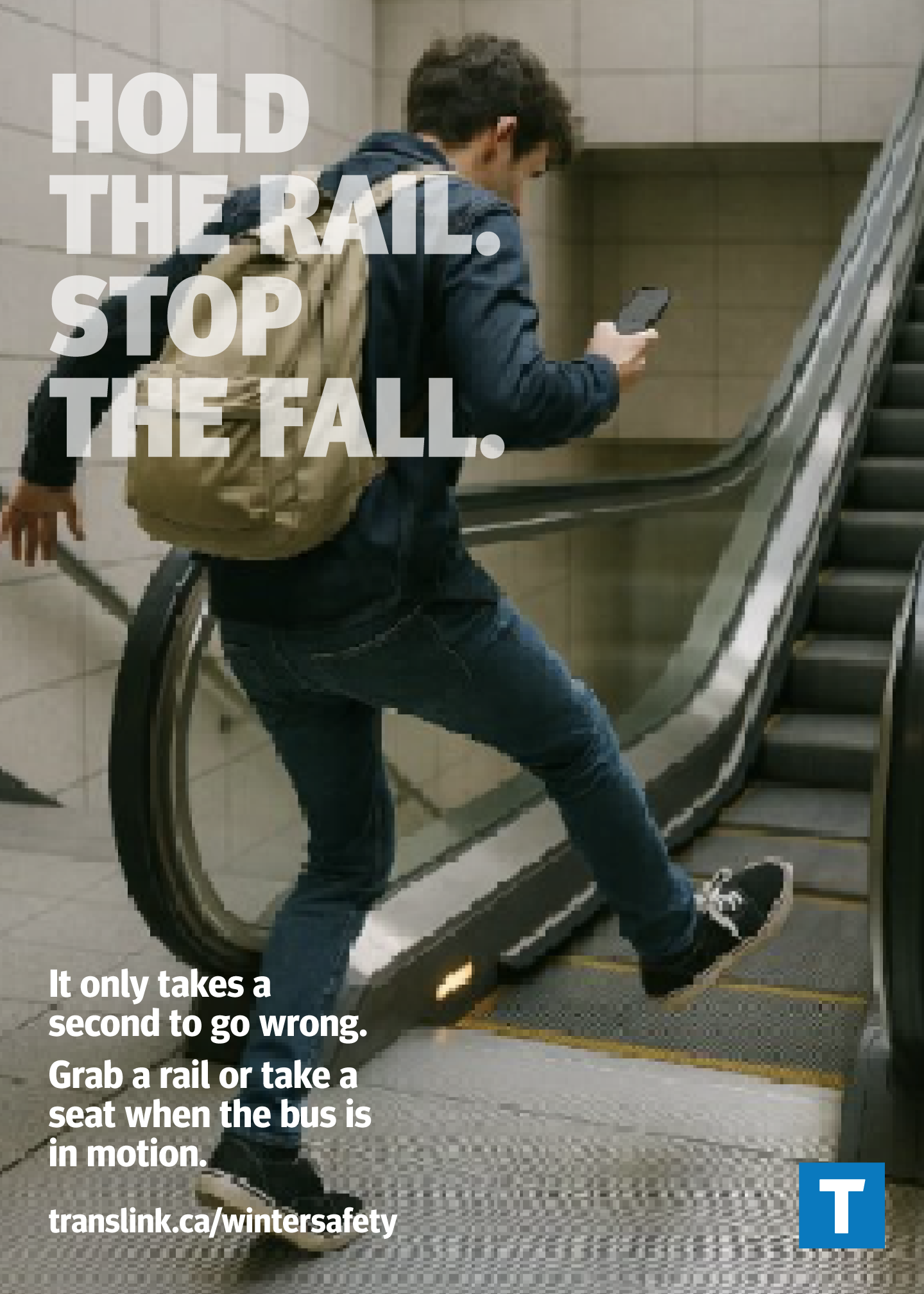
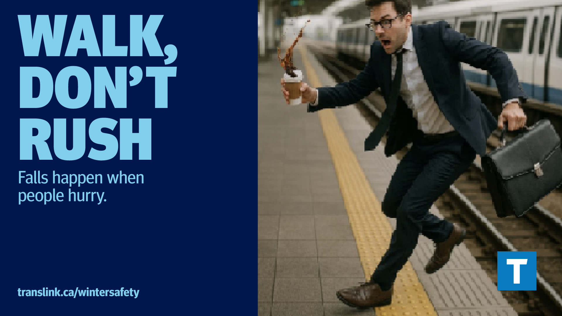
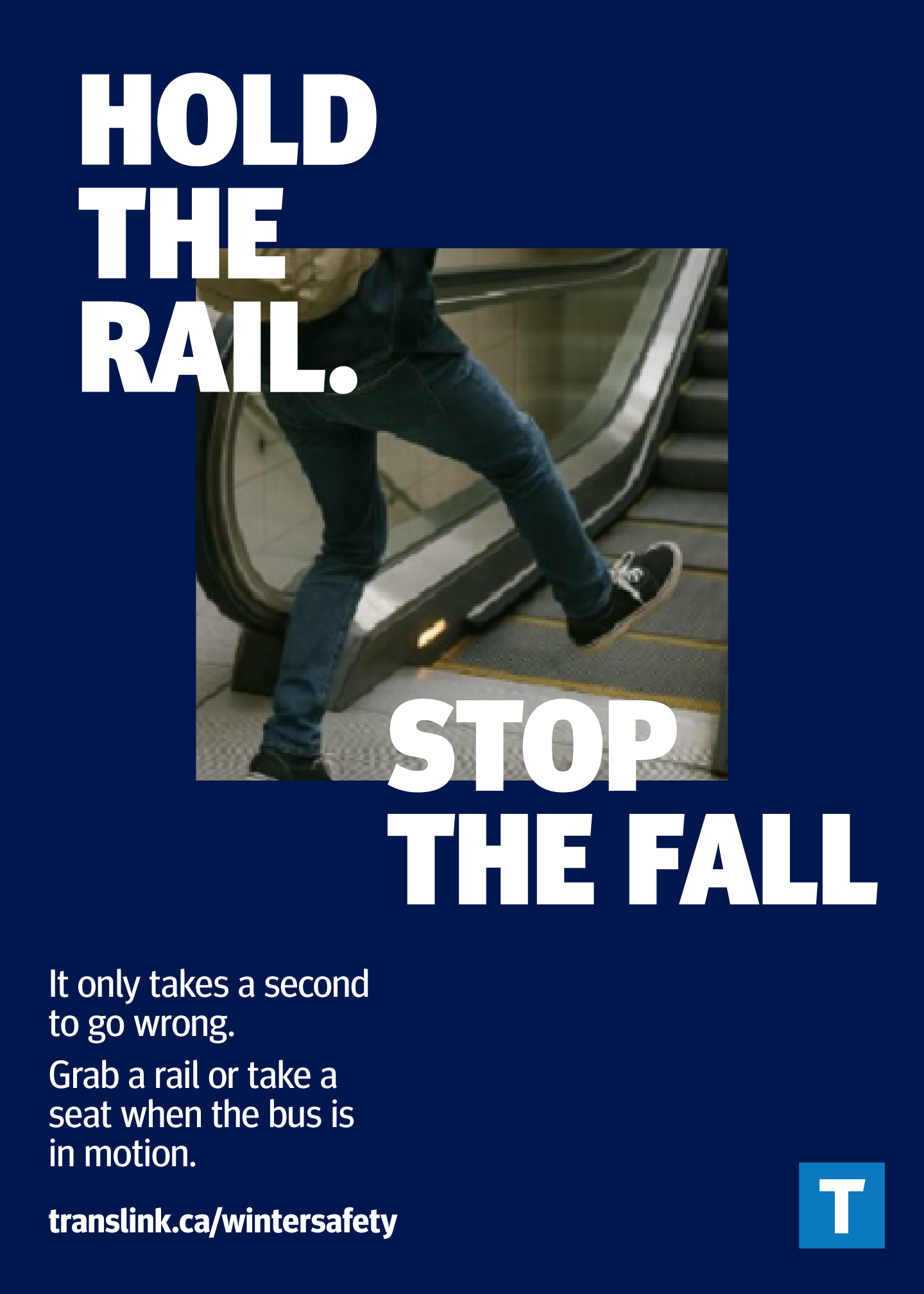
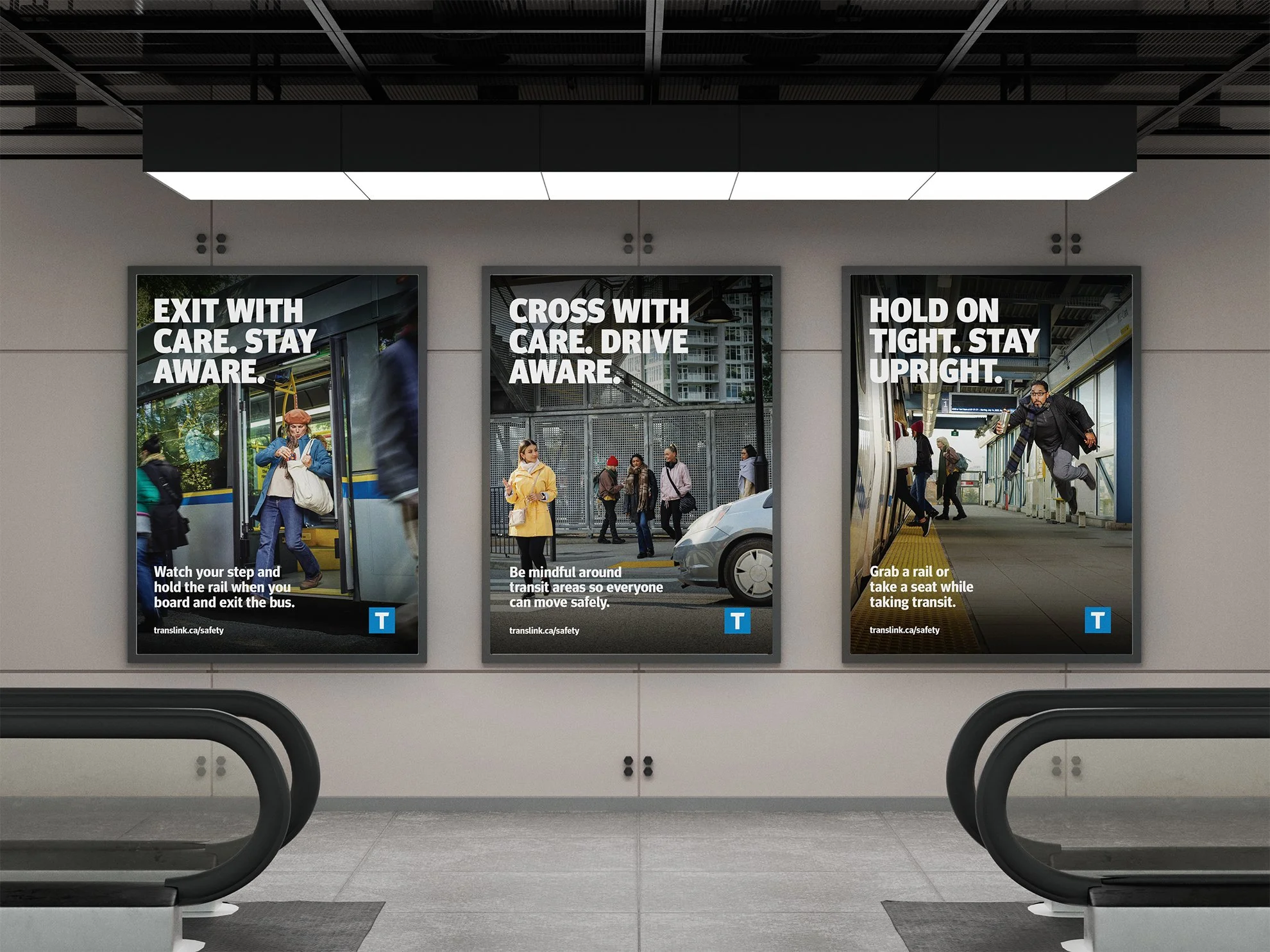
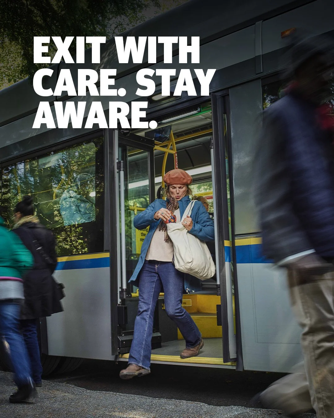
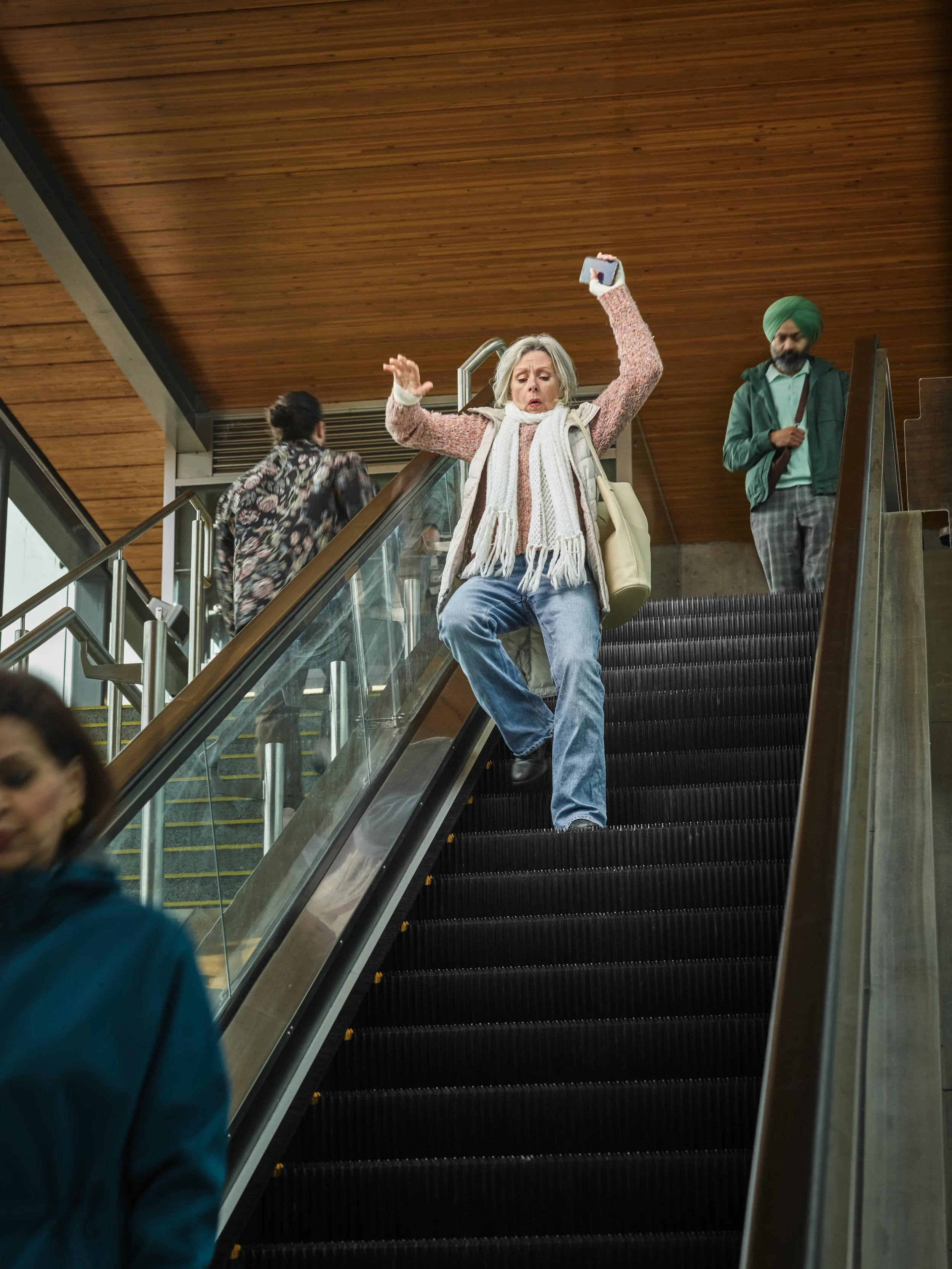
Safety incidents on transit are predictable, but highly varied — from rushed commuters on platforms and slips on escalators to mobility challenges and late-night intoxication. The challenge was to address these behaviours in a way that felt direct and impactful without being fear-mongering or shaming.
The work needed to live across stations, vehicles, digital screens, and social — and remain flexible enough to evolve year over year as new safety issues emerged.
Insight & Direction
Research revealed a few key insights:
Riders respond best to clear, direct messaging
Fear or shock increases memorability, but can easily cross into alienation
Photography significantly outperforms illustration
People engage more when they see real, relatable transit moments
The creative direction focused on creating that moment of recognition — the quiet “oh yeah, I’ve definitely done that” — because awareness is where behaviour change begins.
My Role
I led the visual direction and execution of the campaign, translating research and risk data into a cohesive visual system. I collaborated closely with internal teams to ensure the work balanced clarity, emotional impact, and brand consistency across all touchpoints.
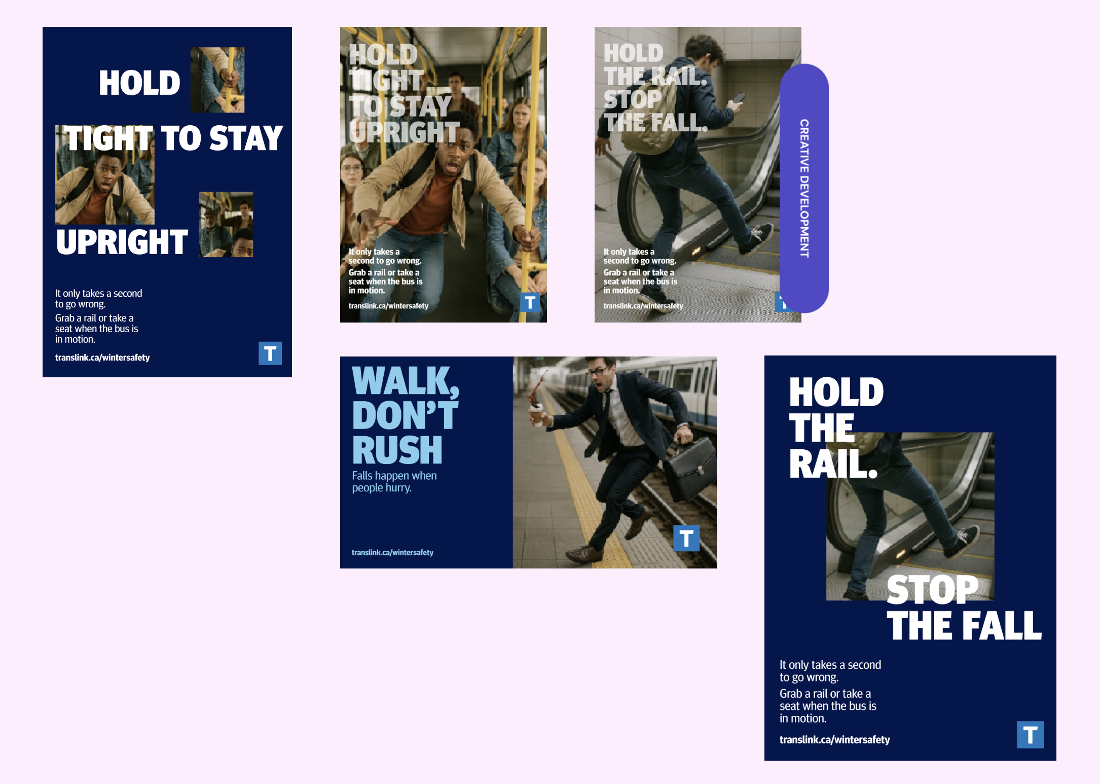
Execution
Rather than designing a single set of posters, the campaign was built as a flexible system:
Campaign photography grounded in real transit behaviour
Clear typographic hierarchy to communicate risk quickly
Static posters, digital screens, and social assets
Reusable templates to support future safety messaging
Although refreshed annually, the system was designed to scale and evolve — supporting new scenarios, audiences, and environments without losing clarity or tone.

This wasn’t just about making posters. It was about shifting behaviour and preventing real injuries. The brief demanded realism, relatability, and a visual system that immediately communicates risk.
CREATIVE DEVELOPMENT

Outcome
This campaign wasn’t about aesthetics alone — it was about reducing real injuries and improving rider safety through thoughtful, human-centred brand expression. The result is an adaptable campaign framework that continues to support safety messaging across the transit system year after year.