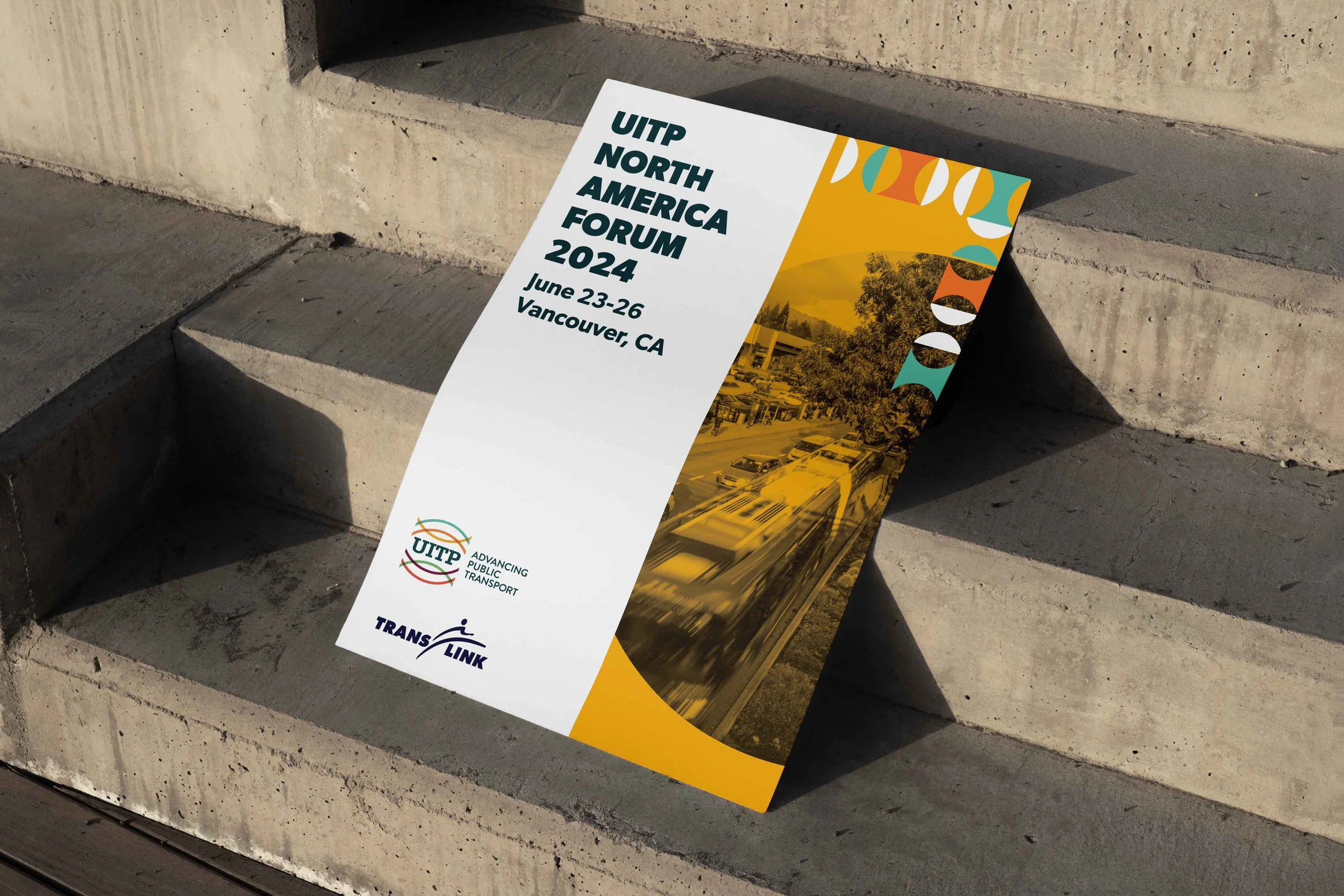
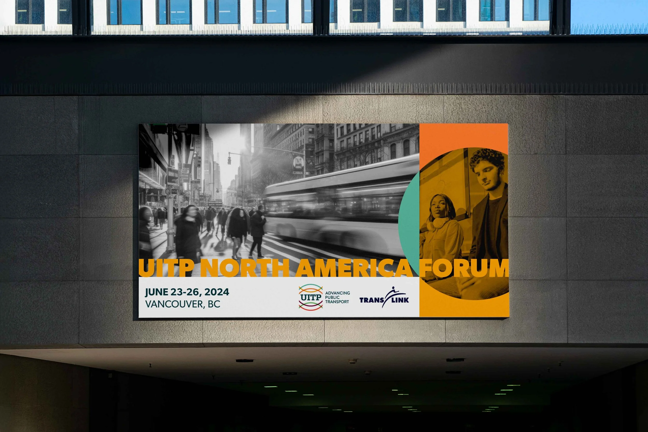
UITP North America Forum 2024
A cohesive event brand system designed to support a large-scale, multi-day transit conference — balancing clarity, professionalism, and visual distinction across digital, print, and environmental touchpoints.
EVENT BRAND SYSTEM · VISUAL IDENTITY ·
MULTI-TOUCHPOINT EXECUTION
The UITP North America Forum brings together public transit leaders, planners, and industry partners from across the region. The event needed a strong visual identity that could unify a wide range of content — from keynote programming and sessions to wayfinding and promotional materials — while still feeling modern, credible, and approachable.
The brand had to work hard: across platforms, across venues, and across a diverse professional audience.
The Challenge
Conference branding often struggles with consistency. This identity needed to:
Support a dense schedule of programming and information
Scale across digital, print, and physical environments
Feel professional and authoritative without being dry or generic
Remain flexible enough to accommodate future events and iterations
The system needed to be clear first — but still visually engaging.
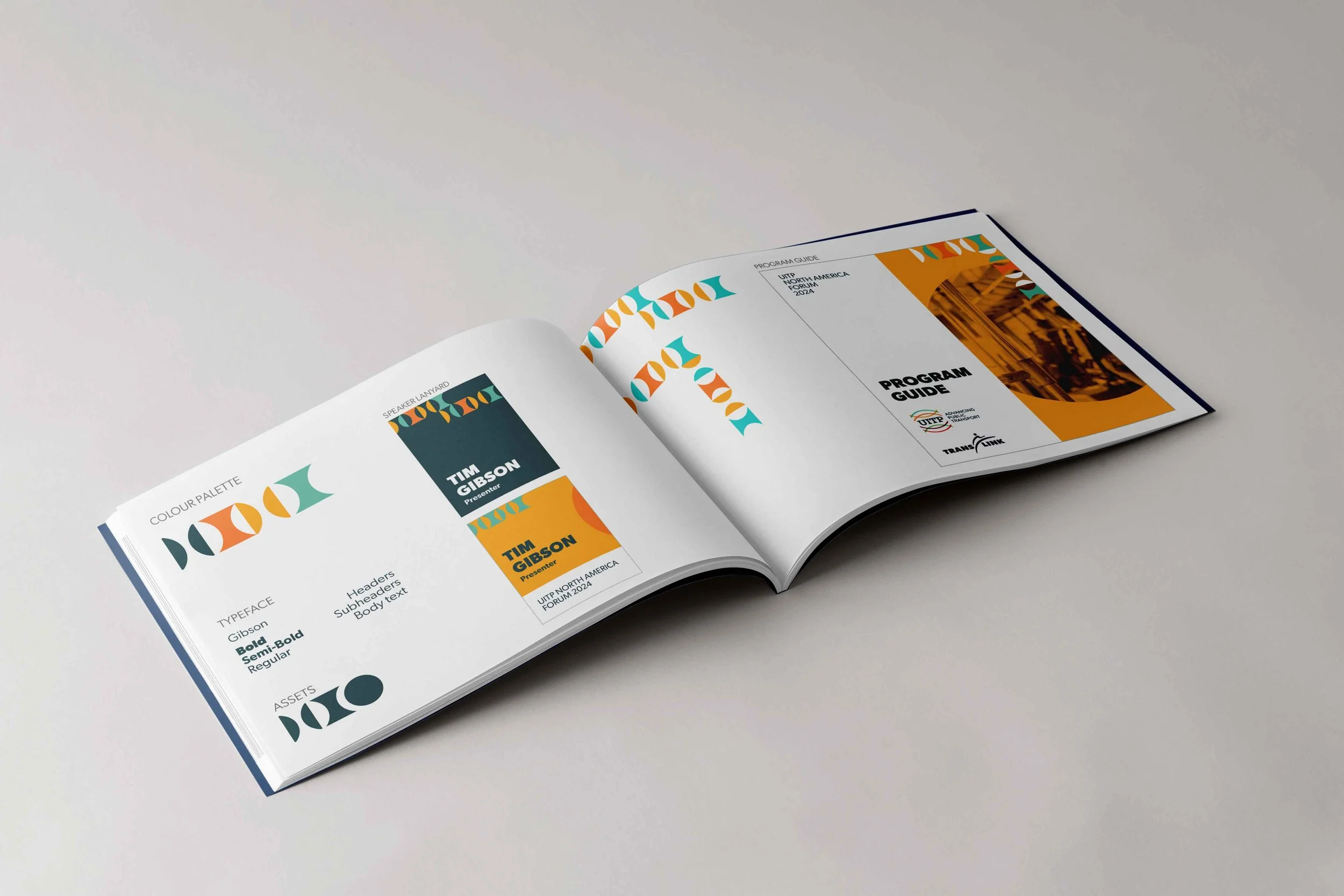
Designed to Scale
The identity was built as a flexible system rather than a one-off event look. Core elements — typography, layout, and visual hierarchy — were designed to support future forums, new content, and evolving formats without requiring a full redesign.
This approach ensures long-term consistency while allowing each event to feel distinct and relevant.
My Role
I led the visual design and execution of the event identity, developing a cohesive system that could be applied across all major touchpoints. I collaborated with internal teams and stakeholders to ensure the brand worked seamlessly across communications, signage, and on-site materials.
Constraints & Considerations
The event identity needed to perform under real-world constraints:
Tight timelines tied to event production and promotion schedules
Multiple venues with varying spatial and signage requirements
Large volumes of content requiring clear hierarchy and quick comprehension
Diverse audiences, including speakers, delegates, and sponsors
These constraints informed every design decision — prioritizing clarity, consistency, and adaptability across environments.
Design Approach
Rather than treating each asset as a one-off, the focus was on building a repeatable event brand system.
Key elements included:
Visual identity: A clear, recognizable look that could stand on its own while aligning with UITP’s broader brand
Typography & hierarchy: Strong typographic structure to support schedules, session information, and wayfinding
Colour & layout systems: Flexible enough to accommodate large amounts of content without sacrificing clarity
Consistency across formats: Ensuring the identity translated cleanly from digital promotion to physical, on-site experiences
Every element was designed with legibility, hierarchy, and scalability in mind.
Execution
The final system was applied across a wide range of deliverables, including:
Digital promotion and event communications
Print materials and conference collateral
On-site signage and wayfinding
Presentation templates and branded environments
By using a modular system, the identity supported both pre-event promotion and the live conference experience without feeling fragmented.
Outcome
The resulting event brand provided a clear, unified visual language that helped attendees navigate the forum with ease while reinforcing UITP’s credibility and professionalism. The system was designed to be adaptable, allowing future events to build on the same foundation without starting from scratch.