Wayfarer
Designing a Sign-Up Flow That Earns Trust Before It Asks for Anything
Wayfarer is a travel brand for independent explorers — solo travellers looking for experiences that feel personal, not packaged. This project had two parts: redesign the Wayfarer homepage, and design a sign-up and travel preferences flow that collects enough to personalize the experience without making a new user feel like they’re filling out a tax return.
The core challenge across both was the same: how do you make someone feel like Wayfarer already understands them, before they’ve told you anything?
Client: Designlab — UX Fundamentals
Role: UX Designer
Scope: Homepage redesign (desktop + mobile) · Multi-step sign-up and travel preferences flow · Component library
Timeline: 6 Weeks
UX DESIGN · INTERACTION DESIGN · FIGMA · PROTOTYPING
The Homepage
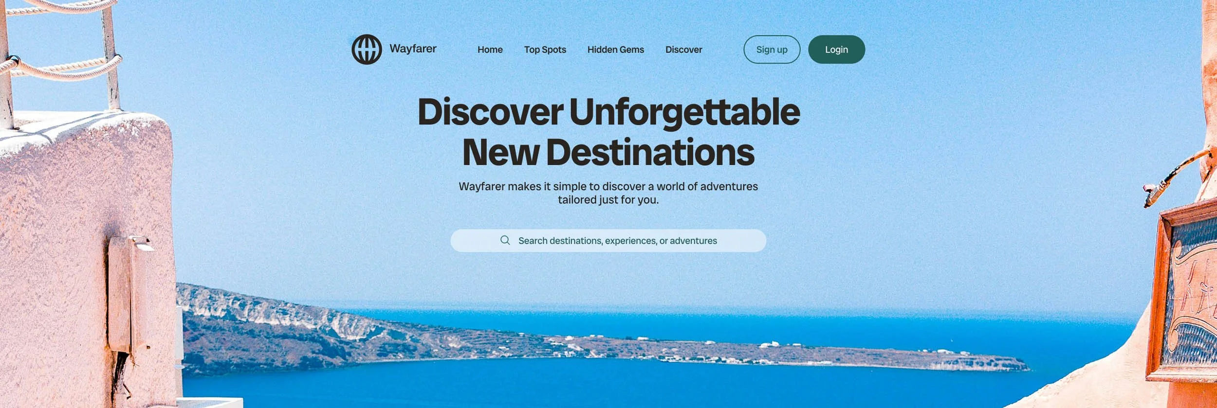
The homepage establishes the brand before the form ever asks for anything. The hero leads with "Discover Unforgettable New Destinations" — a destination search bar sits directly below, keeping the primary action front and centre. Below the fold, editorial destination cards (Papua New Guinea, Bhutan, Ethiopia) do the brand work: they signal that Wayfarer isn't a booking aggregator, it's a curation platform. The copy on each card is deliberately spare — one or two lines that feel more like travel writing than product copy.
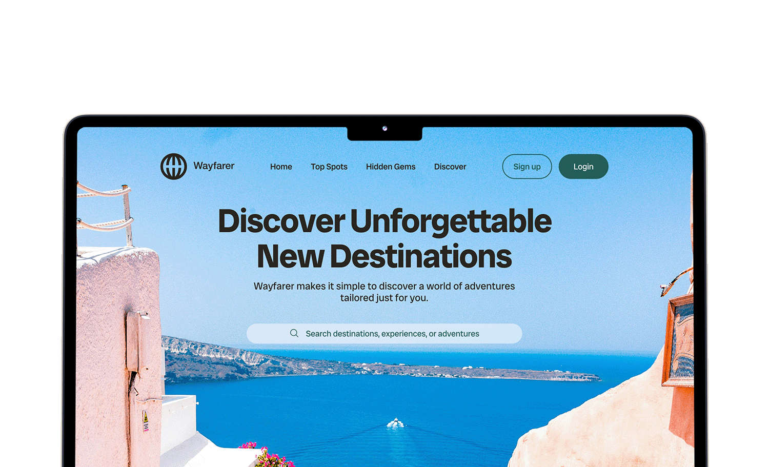
The terracotta CTA section mid-page anchors the sign-up prompt in aspiration rather than conversion pressure. The colour shift from the cream/teal upper sections gives it visual weight without feeling like a hard sell.
Process
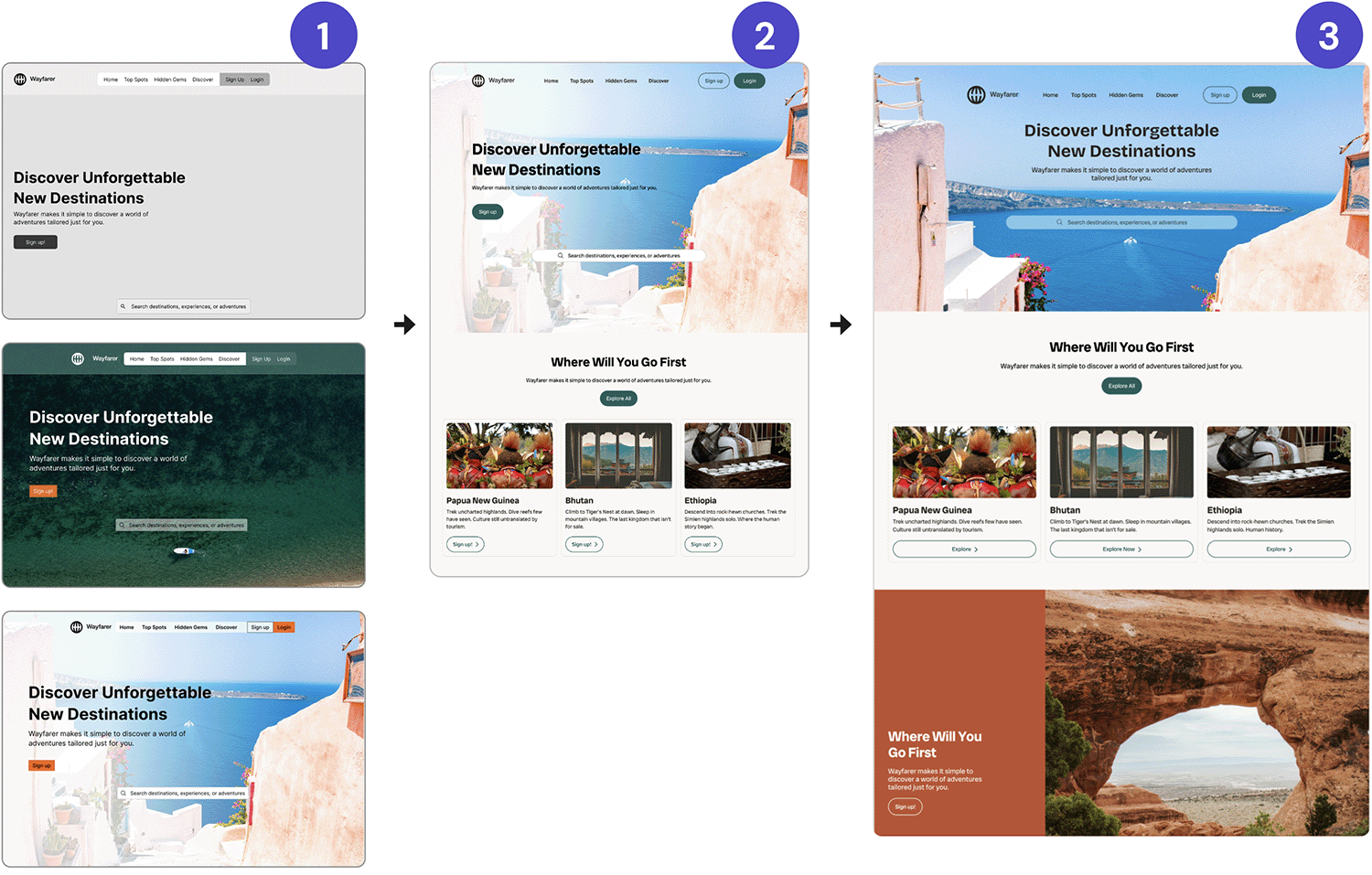
1. Work in progress.
2. Direction chosen. Increased text size and button sizes, aligned to the grid, and a more elegant navigation bar, following feedback.
3. Further play and iteration, following alternate layouts, global text alignments, and use of AI in the iterating and experimenting process.
1. Work in progress.
2. Direction chosen. Increased text size and button sizes, aligned to the grid, and a more elegant navigation bar, following feedback.
3. Further play and iteration, following alternate layouts, global text alignments, and use of AI in the iterating and experimenting process.
Style Tile
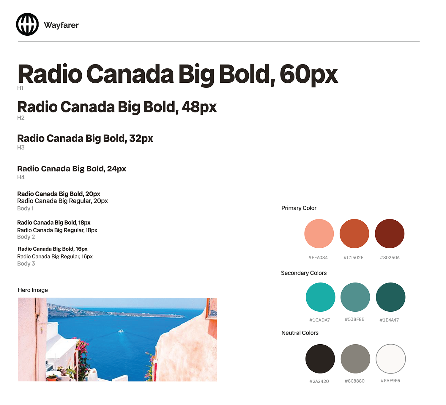
Bold, friendly, and readable font chosen for the headlines, which is also highly readable at small scale, allowing the same typeface to be used for body.
Warm primary colours separates Wayfarer from competitors, who overwhelmingly choose greens and blues.
Teal secondary colour brings in a contrasting cool tone to brighten up the palette, while using warm tones alone, especially clay, run the risk of appearing dry and faded.
The teal, along with vibrant photos, work together to ensure the site is vibrant, linking back to the brief.
Mobile Iterations
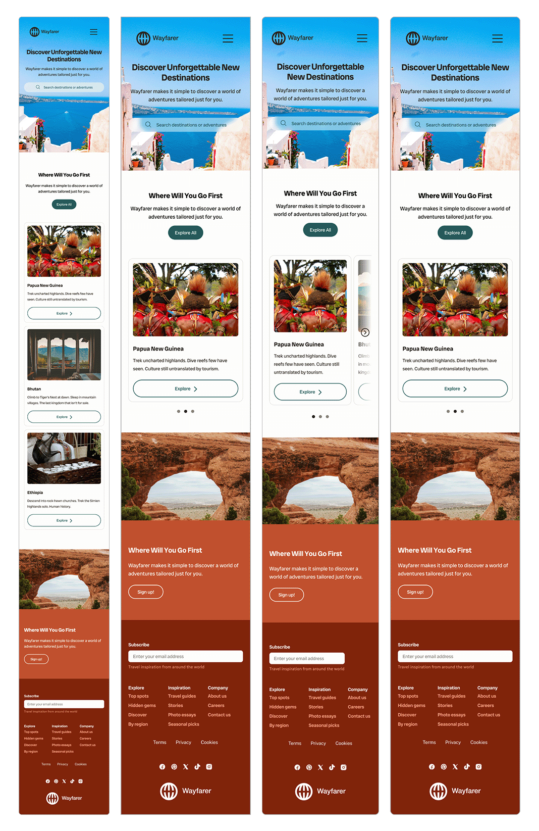
I worked through four iterations of the mobile layout, primarily around the destination card treatment. The final direction moves to a paginated carousel — one card visible at a time with dot navigation — which keeps the imagery large and avoids the cramped three-column grid that read poorly at small sizes. The footer nav consolidates into three columns (Explore / Inspiration / Company), mapping to how a user would actually navigate the product once signed up.
The iteration work here was where the most useful decisions happened — the shift to a carousel was only obvious after seeing the grid version at actual mobile size. Responsive design decisions don't fully resolve in the desktop frame.
The Sign-up Flow
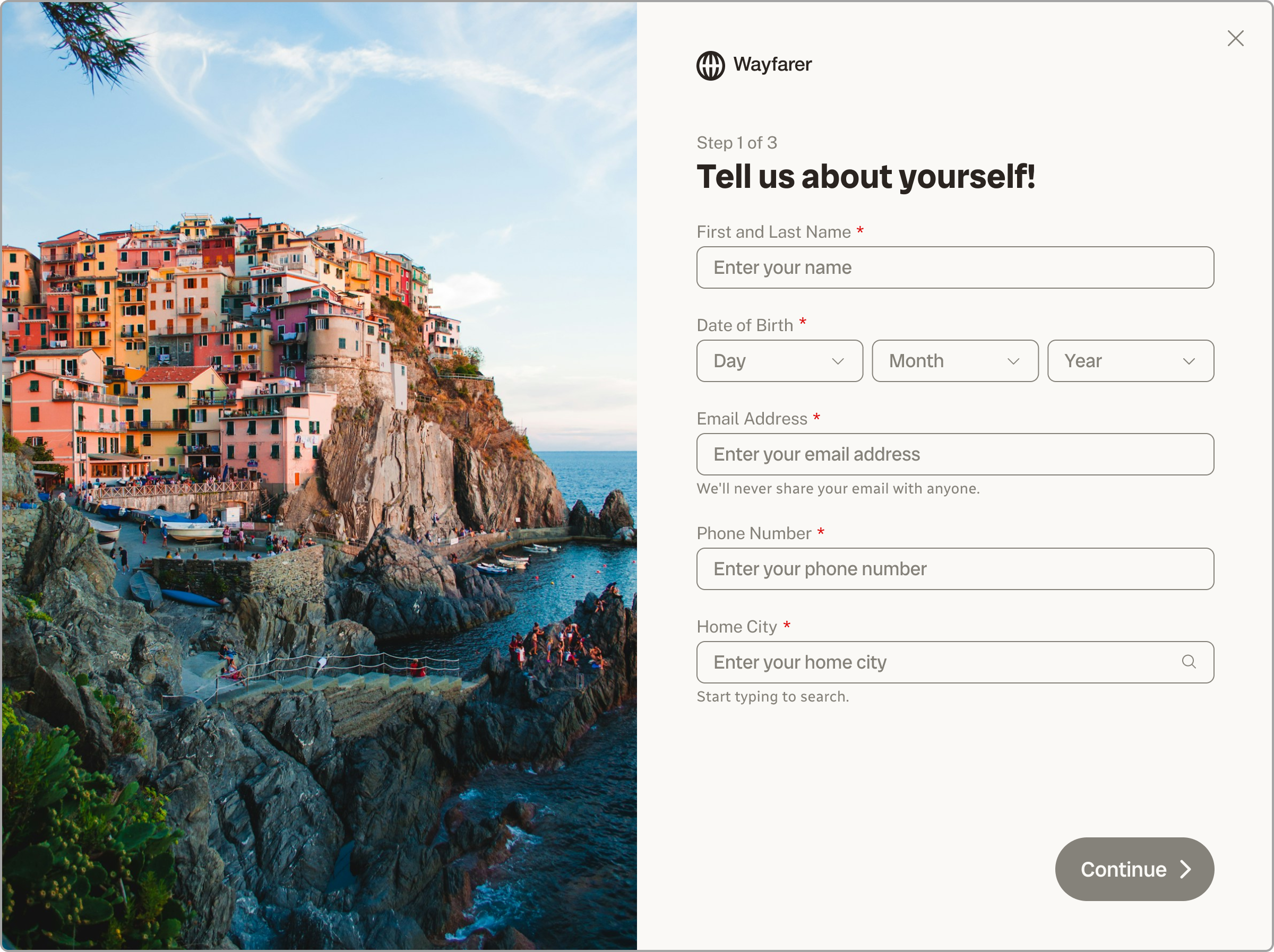
The form splits across three screens: personal information, travel preferences, and a review screen before submission. This sequencing mirrors how trust actually builds. Name and email are low-stakes asks that most users complete quickly. Preferences are more considered and more personal. The review screen gives the user agency before anything is committed.
A dot progress indicator runs across the top of all three screens. Dots — rather than a labelled step bar — keep the UI light and avoid front-loading the user with how many questions are coming.
Input Type Decisions
Each field type was chosen to reduce friction at that specific moment in the flow — not just for visual consistency. Every input type communicates something about the nature of the question. Getting that right, rather than defaulting to the standard component, is where UX thinking and brand thinking overlap.
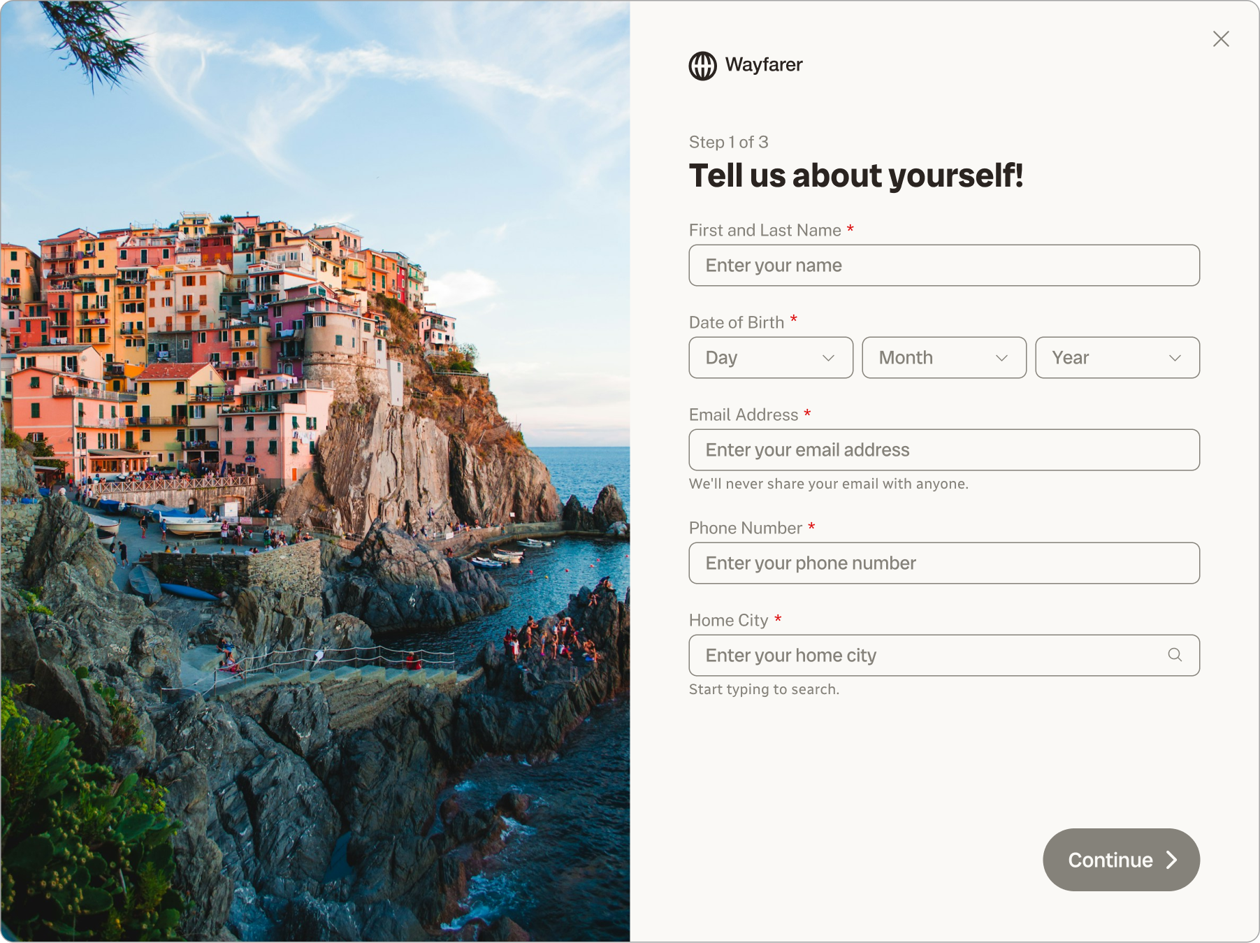
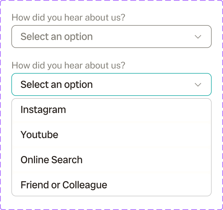
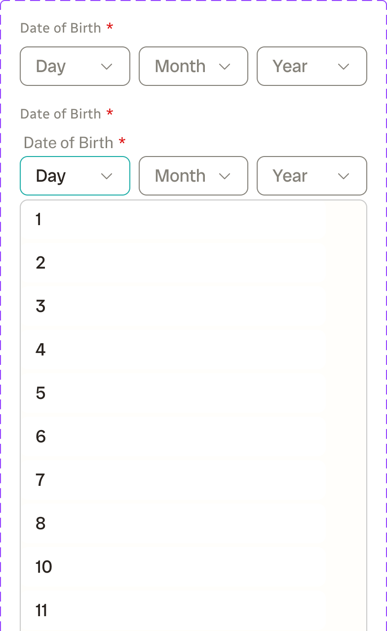
Date of birth → Three dropdowns, not a calendar picker. Calendar pickers are built for selecting future dates. For a date of birth, the user already knows the answer. Three dropdowns (Month / Day / Year) are faster, work better on mobile, and reuse an existing dropdown component — no new UI excess.
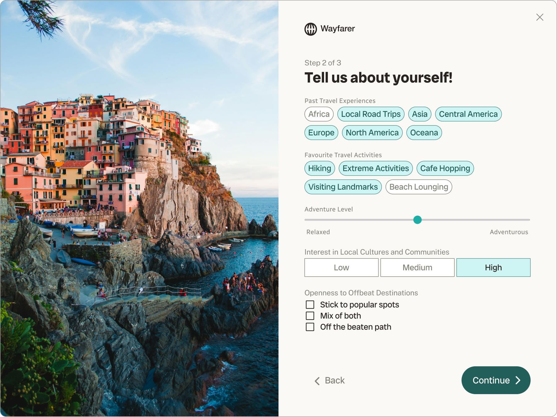
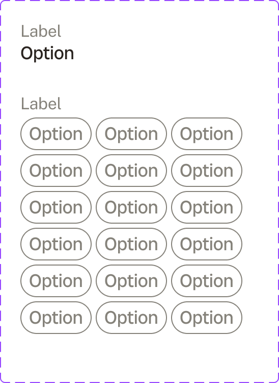
Past travel experiences and favourite activities → Multi-select chips. Both fields involve selecting from a defined set where multiple answers are expected and equally valid. Chips are touch-friendly, visually scannable, and don't require reading a label next to a small checkbox. At scale, they keep the page feeling light.
Adventure level → Slider. Adventure level is a spectrum with no discrete right answer. A slider communicates this is a range, not a category, and lets the user place themselves naturally.
Interest in local cultures and communities → Segmented control. Unlike adventure level, cultural interest maps to a small set of distinct options where the difference between them matters for personalization downstream. A segmented control signals real categories, not arbitrary points on a line.
Openness to offbeat destinations → Radio group. A single-answer question with a small, defined option set. Radio group is the right tool: clear, accessible, unambiguous.
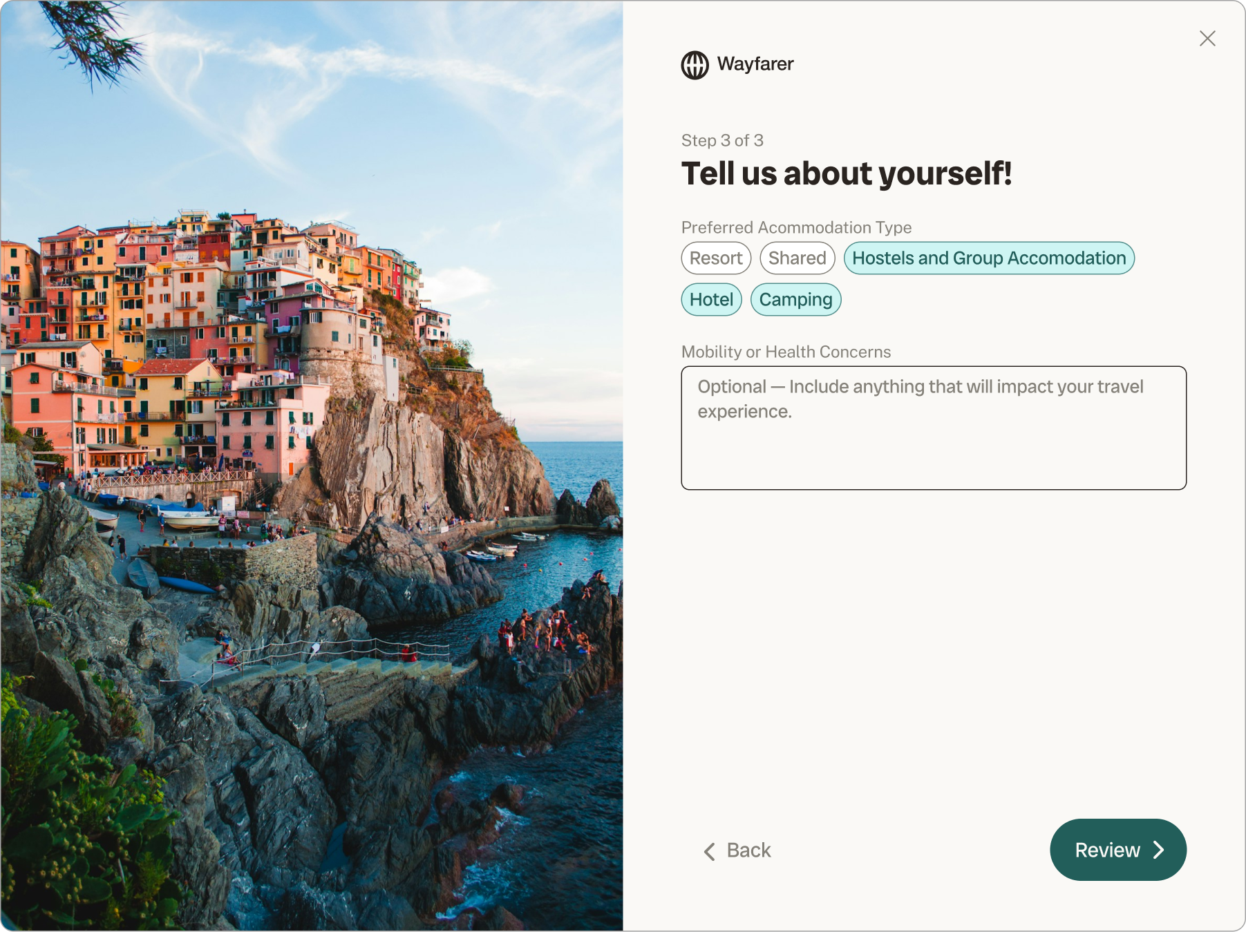
Mobility or health considerations → Optional text area. This field exists because it genuinely affects trip planning — but it's sensitive and not relevant to every user. Making it optional and open-ended respects that. The label was written to frame it as a service to the user, not a data collection exercise.
The Review Screen
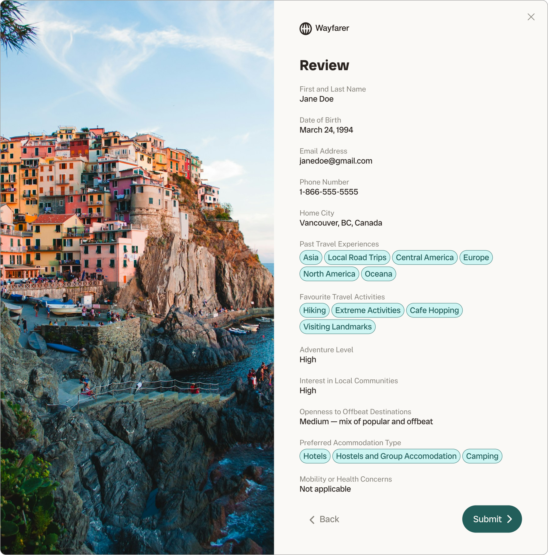
The review screen before submission is a small decision with meaningful impact. Most sign-up flows skip it and go straight to a confirmation state — which means any error the user made is already committed. The Wayfarer flow shows a structured summary of everything entered across both pages, with the ability to go back before submitting.
For a form asking personal and preference-level questions, this isn't just a UX courtesy — it's a trust signal. You told us things; here's proof we heard them correctly.
Component Library
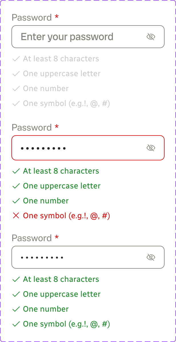
The form was built on a component library developed alongside the flow: an input-main component with label, placeholder, helper, and error states with a required toggle; dropdown/menu; checkbox-terms; buttons; header; input-search; and a validation row. Building to a library meant every state — empty, filled, error, disabled — was accounted for before a single screen was wired up, and the prototype behaved consistently throughout.
The Prototype
Prototype walkthrough — the form modal overlays the homepage in context, keeping the destination visible throughout the sign-up flow.
Reflection
If I were to extend this, the next priority would be the mobility and health considerations field — specifically how that information surfaces in trip recommendations. Collecting it without visibly acting on it is a trust problem. I’d also prototype the transition between form steps to confirm the dot indicator updates feel clear without being distracting.
The bigger learning was about input type as a design decision, not a default. Every field type communicates something about the nature of the question. Getting that right — not just picking the standard component — is where UX thinking and brand thinking overlap.