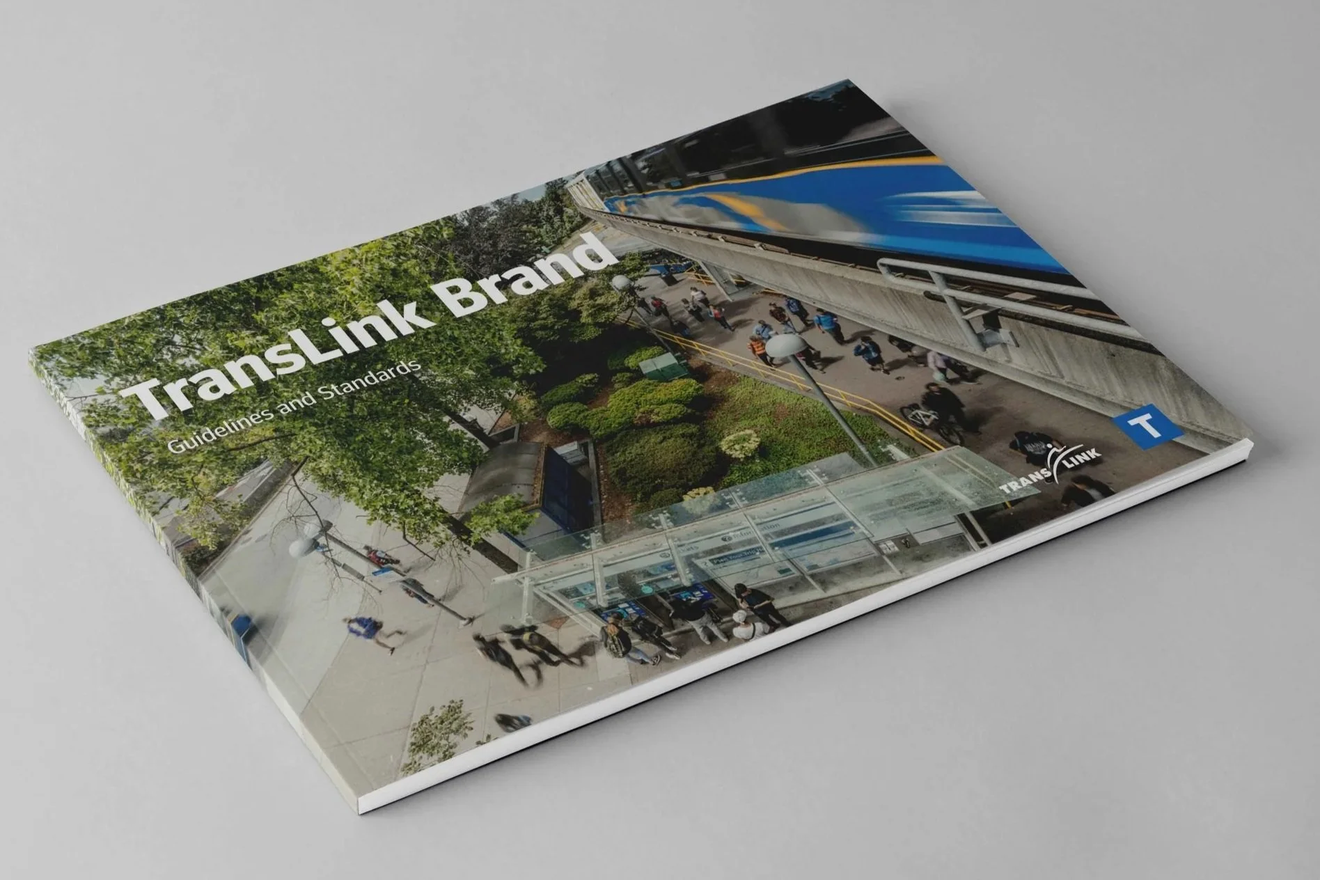
TransLink Brand Refresh
A comprehensive brand refresh for a major public transit authority, designed to modernize a 25-year-old identity while improving clarity, accessibility, and consistency across physical and digital environments.
BRAND STRATEGY · DESIGN SYSTEMS · VISUAL EXPRESSION
TransLink is responsible for connecting hundreds of thousands of people across Metro Vancouver every day. Its brand needed to support a growing, evolving organization while remaining familiar, trustworthy, and easy to navigate for a diverse public audience.
What began as a request to update a 25-year-old logo quickly revealed a larger opportunity: evolve the entire brand system so it could better support modern transit use, expanding communications needs, and increasingly complex touchpoints.

The Challenge
Public transit branding carries unique constraints. The system needed to:
Serve a wide range of audiences, including commuters, families, seniors, and visitors
Prioritize clarity, legibility, and accessibility
Scale across signage, vehicles, digital platforms, campaigns, and internal communications
Feel modern and confident without losing familiarity or trust
The refresh had to balance evolution with continuity — improving the brand without alienating riders who rely on it daily.
Everyday, half a million people depend on us to connect them with the people and places that matter most. And through this dedication to delivering transportation excellence—including fostering economic efficiencies and sustainability—we are committed to creating a better place to live, for everyone.
– TransLink Brand Book

Execution
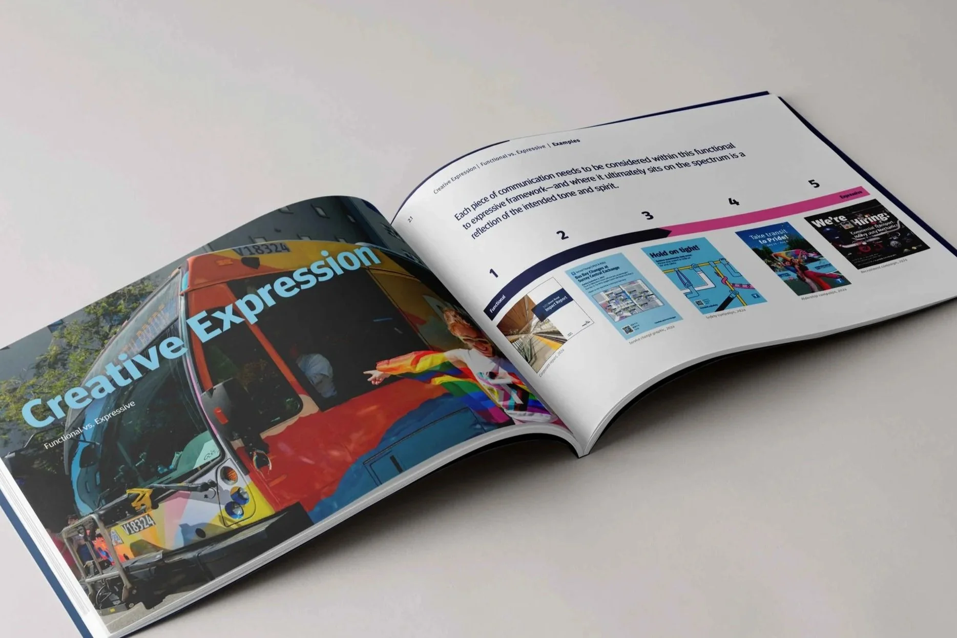
The final brand system was designed to work seamlessly across a wide range of touchpoints, including:
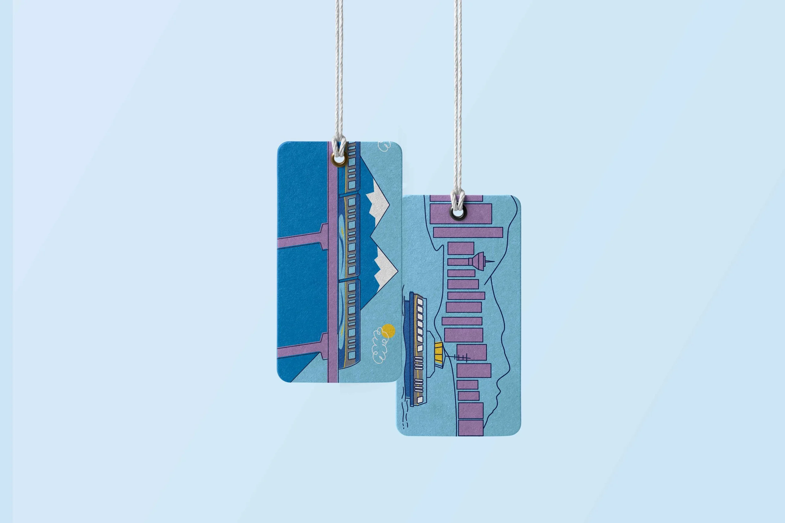
Environmental signage and wayfinding
Vehicle exteriors and interiors
Digital platforms and communications
Marketing campaigns and informational materials
By focusing on modularity and consistency, the system allows teams to create new materials efficiently while maintaining a unified brand voice.
Outcome
The refreshed TransLink brand provides a clear, modern foundation that supports the organization’s day-to-day operations and long-term growth. It balances clarity and personality, helping riders navigate the system confidently while giving internal teams a flexible framework for future communications.